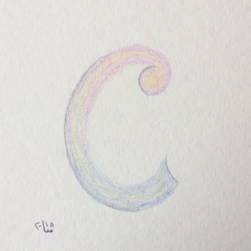
C for… Contrast
It’s interesting to see that adding just a little bit of contrast to pastel shades can bring rather flat colours to life.
Contrast – Kontrast
Es ist interessant zu erleben, dass es reicht, ein winzig klein wenig Kontast hinzuzufügen um eher blasse Pastellfarben zu beleben.

Farbstifte auf Aquarellpapier 300g/m2, 15cm x 15cm
Colour pencils on watercolour paper 300g/m2, size: 15cm x 15cm
©Marie-Christine Chammas – alle Rechte vorbehalten – all rights reserved